ARTICLES
Bootstrap 4 Finetuning
The Bootstrap 4 Migration is about to be finalized. When we showed the work to the community (and also around internally) the feedback was mostly positive. Some pages did not render properly, but besides that the most commonly reported issues were:
-
Card Headers use up too much space
-
Elements use up too much space in general
-
Concerns about the blue as this is supposed to be reserved for OpenNMS Meridian
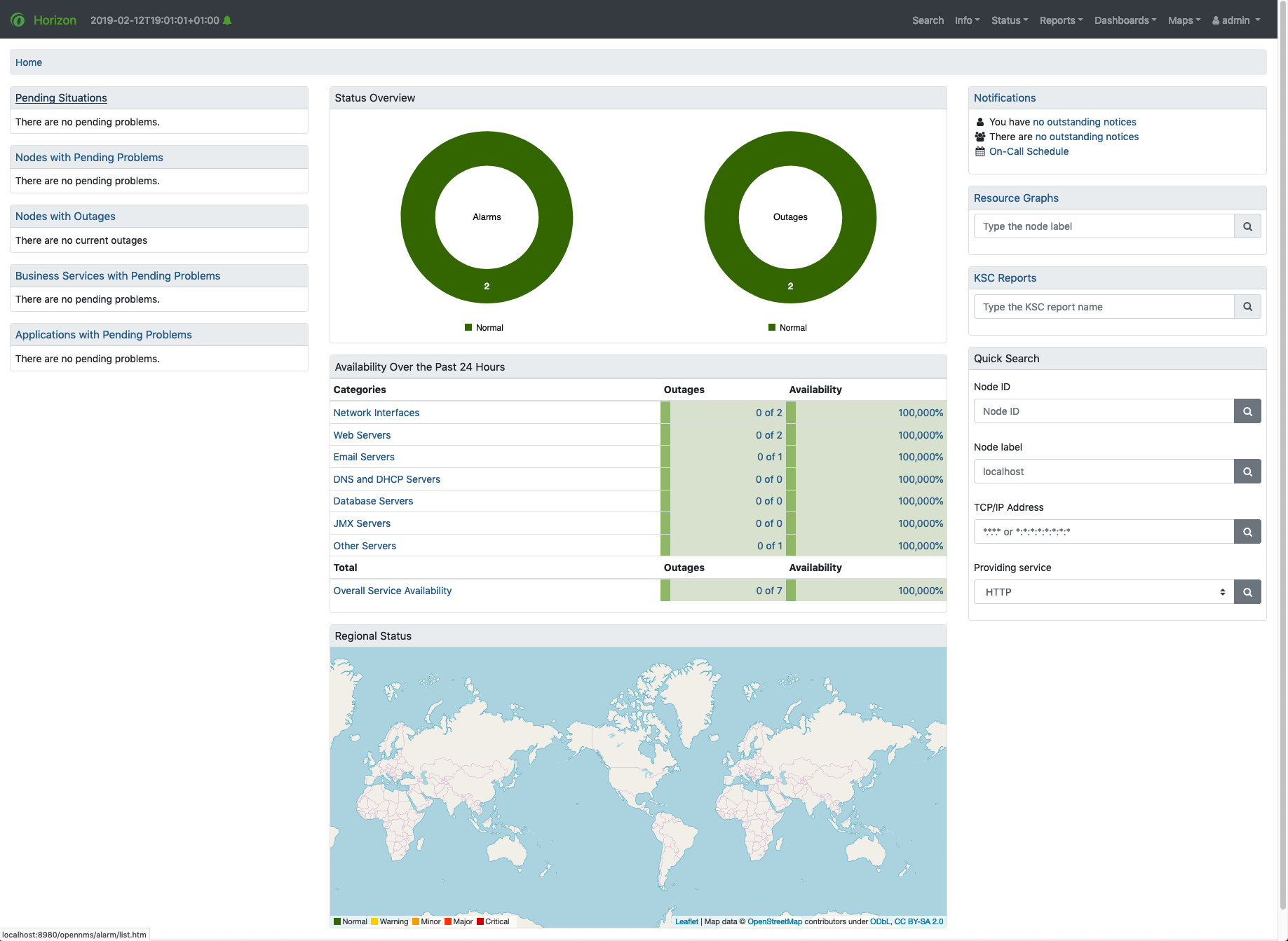
While the first two issues were very easy to fix, the last one took some thinking. Afterwards I worked with Jessica to get the last bits sorted out. The result of this was that too much branding is not needed at this moment. We settled on a darker blue version (mostly for links), made the card headers bigger and highlighted the header backgrounds more.
Also we reworked the headers.
This is how it looks now: